Showing posts with label charts. Show all posts

01 July 2014

The Evolution of Cranial Capacity in Humans and Stem-Humans

(Hey, I'm actually writing on the blog's title subject today!)

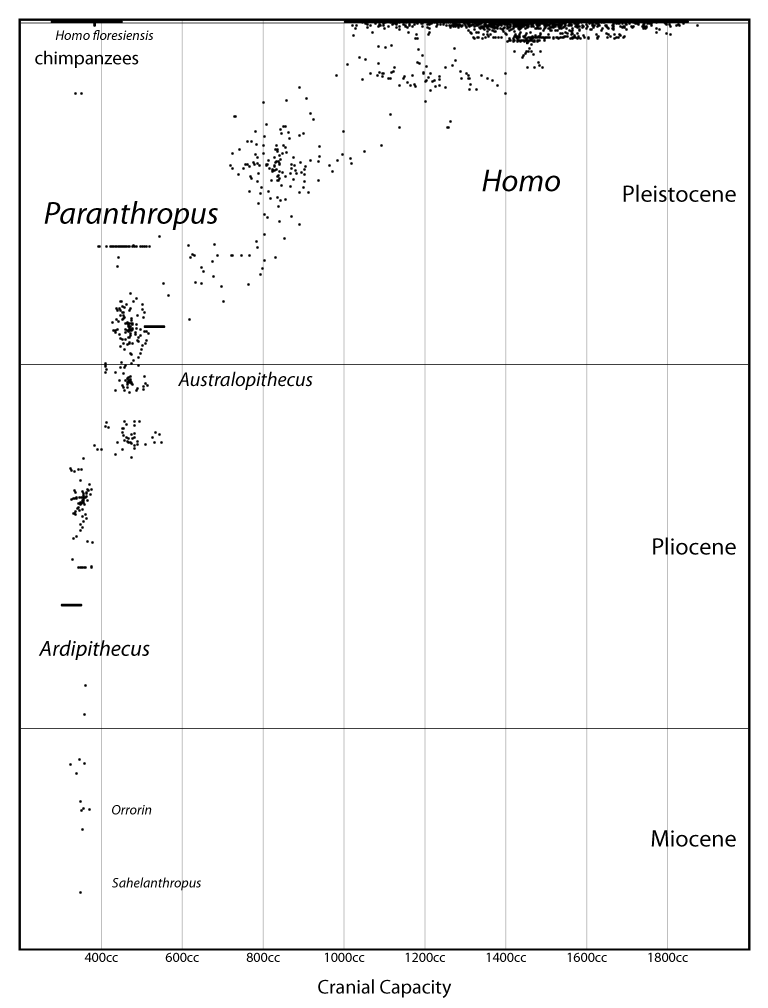
Here's a chart I've been working on for a while:


This shows all known human and stem-human individuals, plotted according to stratigraphy and cranial capacity (endocranial volume). The fossil individuals with known cranial capacity are highlighted as white circles; other fossil individuals' probable capacity is inferred from these. The "chimpanzee range" shows the span between a normal female bonobo chimpanzee (Pan paniscus) and a normal male common chimpanzee (Pan troglodytes) (Begun & Kordos 2004); the full range for chimpanzees (Pan) is slightly larger (but not much). The "human range" shows where about 90% of living humans fall (Burenhult 1993). UPDATE: My mistake, it's the range of ~90% of living humans combined with the range of Upper Pleistocene humans (which is actually higher, on average).

Some notes:

02 January 2013

All Known Great Ape Individuals (Messinian to Present)

Happy 2013, everyone!

Recently I announced a code package I was working on, called Haeckel, for generating vector-based charts related to evolutionary biology. Here's an image I've created using it:

Known Great Ape Individuals
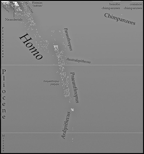
This chart represents all known hominid individuals (Hominidae = great apes, including humans and stem-humans) from the Messinian to the present, erring on the conservative side when the material is too poor to determine the exact number.

If you've been following this blog for a few years you may remember an earlier version of this. I've done a lot of refinement to the data since then. The earlier versions were dissatisfying to me because the horizontal axis was essentially arbitrary. For this version I used matrices from a phylogenetic analysis (Strait and Grine 2004, Table 3 and Appendix C) of craniodental characters to generate a distance matrix, and then inferred positions for other taxa based on phylogenetic proximity and containing clade. This is similar to the metric I used in this chart, except that it incorporates Appendix C, uses inference, and averages distance from humans against distance from [Bornean] orangutans. Don't be mistaken — this is still arbitrary. But it's a bit closer to something real.

Stray notes:
  • I'm pretty sure there are Pliocene stem-orangutans somewhere, right? Might have some work left to do on that data.
  • The dot with no taxon above "Australopithecus" is an indeterminate stem-human from Laetoli. It should probably go further left.
  • The Ardipithecus bubble includes the poorly-known "Australopithecus" praegens. (Although in some runs it moves outside — there's a random element to the plotting.)
  • The Holocene is barely visible up at the top. What a worthless epoch.
  • Homo floresiensis (hobbits) are far to the left of Homo sapiens because I placed them outside Clade(Homo erectus ∪ Homo sapiens).
  • You may recall Lufengpithecus? wushanensis as "Wushan Man", as it was originally placed in Homo erectus. (Hey, it's just teeth.)
  • A couple of fossil chimpanzees, lots of fossil orangutans, but no fossil gorillas. :(
    • (Unless you count Chororapithecus, but that's pre-Messinian. Very pre-Messinian. Suspiciously pre-Messinian....)
  • Look at all that overlap between Homo, Paranthropus, and Australopithecus!
    • I have a feeling, though, that if I added another dimension, Paranthropus and Homo would jut out in opposite directions.
    • Reclassifying Australopithecus sediba as Homo sediba would also decrease the overlap. (Although its position is inferred — actually scoring it might do the same thing.)
    • It's frustrating that the type species of Australopithecus and Paranthropus are also just about the most similar species across the two genera.
  • Kenyanthropus and Praeanthropus have been provisionally sunk into Australopithecus.
  • Should we just sink Orrorin and Sahelanthropus into Ardipithecus? Why not?
  • My guess is that if I added postcranial characters, the stem-humans would all shift right (humanward). Oh, for a good matrix of postcranial characters....
Update
Oh yeah, and if you want a peek at the data, go here.

02 December 2012

Haeckel: A Code Library for Browser-Based Evolutionary Diagrams

For a while now I've been writing posts with diagrams like this one, showing the evolution of cranial capacity in mangani over the past seven million years:


How did I make them? Originally it was all ad-hoc ActionScript code, but more recently I've begun to organize the code into a library and translate it into TypeScript (which, in turn, is automatically translated into JavaScript). Although this library is still in progress, I've decided it's at a stage where I can open it to the general public.

This library includes functionality for:

  • Modeling scientific concepts such as taxa, phylogeny, character states, stratigraphy, and geography.
  • Processing scientific data (notably calculating morphological distance and inferring unknown character states).
  • Rendering data into charts as Scalable Vector Graphics, using RaphaëlJS.
For a while I struggled with what to call this library. It's neither purely about science nor purely about graphics. Finally I got my inspiration from RaphaëlJS, a graphics library named after a great artist. I named my library after a man who was both a great artist and a great biologist:

21 August 2012

Closest to Humans: The Skull & Tooth Version

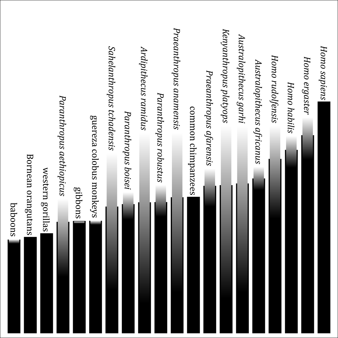
Previously I posted a diagram showing how different various primates are from humans, based on soft tissue characters.  Here is a similar diagram, but using the craniodental characters from Strait & Grine's (2004) matrix. Unlike the soft-tissue diagram, this includes fossil taxa.


This black lines indicate the probable distance, as inferred from the phylogeny. The gradients show the actual range of uncertainty. (They'd also show polymorphism, but this matrix has none.) Ordering is according to probable distance—using the mean of the range of uncertainty yields slightly different results.

As in the soft-tissue diagram, chimpanzees are closer to humans than any other living primates are. But, oddly, gibbons and colobus monkeys are closer to humans than gorillas and orangutans! My guess is that this is because gorillas and orangutans are more derived from the ancestral catarrhine state than gibbons or colobus monkeys. (This probably also explains why the Paranthropus species, a.k.a. "robust australopithecines", are further than chimpanzees, although it is strange that the earliest one, P. aethiopicus, is furthest.)

To the right of chimpanzees is a very unsurprising pattern: "gracile australopithecines", then basal Homo species, then the large-brained Homo ergaster, and finally the huge-brained Homo sapiens.

You can also see how well-known the fossil crania are, ranging from the very well-known Australopithecus africanus to the crushed skull of Kenyanthropus platyops. Note that Ardipithecus ramidus is much better known now than when this study was done.

Again a disclaimer: this is not an objective measure of morphological similarity (there is no such thing), and it is definitely not a phylogenetic analysis (even if the data is taken from one).


References


  • Strait & Grine (2004). Inferring hominoid and early hominid phylogeny using craniodental characters: the role of fossil taxa. Journal of Human Evolution 47:399–452. doi:10.1016/j.jhevol.2004.08.008

17 August 2012

Refinement: Primate Anatomical Similarity

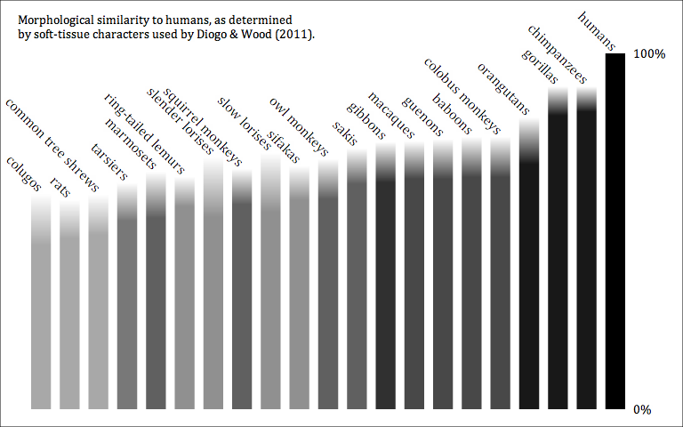
Earlier, I posted a chart showing how similar humans are to other primates (and other euarchontoglires),  as measured from Diogo & Wood's (2011) soft-tissue character matrix. A problem with the earlier version was that it doesn't reflect uncertainty in that matrix. (It also wouldn't show polymorphisms, although that matrix doesn't have any, anyway.) I've created a new version that shows the maximum and minimum possible distance, given the uncertainties in the matrix.


28 February 2011

The First Week of PhyloPic

I announced PhyloPic last week and the response has been great. I launched with ~95 images and we are already up to 170! (Possibly more by the time you read this.) Some of the lineages are becoming pretty complete. Some of the better ones:
For the last one, I made a special collage:

Evolution of the Human

(Click on it and check out the Flickr page to find an extremely high-resolution version.)

Of course, other areas of the Tree of Life are not quite so fleshed out. For example, if you look up a plant you'll usually get this. (Or even less if you didn't happen to pick a tracheophyte.) So there is plenty of illustrating left to do.

There is also plenty of programming left to do. You can see a list of major remaining tasks on PhyloPic's BitBucket page. Here are a few, with links to their pages:
If any of these interest you, I encourage you to vote for them by clicking the "Bump!" button:

And if you have any ideas, you can also suggest features.

At least one blog has created its own PhyloPic feature. Traumador at Art Evolved put together an excellent tutorial on creating silhouettes using Photoshop. (They also posted about PhyloPic here.) Blogger David Tana of Superoceras also awarded PhyloPic his Interweb Science of the Week award.

In summary, the project's going very well and I'm pretty excited about it. I can't wait to see what the rest of the year holds for PhyloPic!

02 August 2010

Phun Phylogenies

Pete Buchholz recently started compiling a phylogeny of edible plants, based on the APG III system. I ran it through Names on Nodes and produced a diagram:


A Phylogeny of Edible Plants


(Unfortunately, this version strips out the clade labels—I'll try and rectify that at some point.)


When I saw this, I though, what a fantastic way to learn plant phylogeny! It's something I don't know much about (apart from basics, like the differerence between gymnosperms and angiosperms), and so I found it fascinating to see the ways the foods I eat are related to each other.


It's such a good idea, I couldn't resist doing another version for edible animals and fungi:


And this reminded me of another project I'd been meaning to start for a while, so I finally took a stab at it. A phylogeny of cartoon animals!


(That's right, there's a stuffed tiger clade.)

06 May 2010

PhyloPainter: Happy Little Trees

The whole Flash/Apple fracas has been rather distasteful to me. But I'm not going to dwell on that right now. Instead, I am trying to keep an open mind by trying out some of the technologies that are competing with my favored development tools. First up: HTML 5.

I'll probably write more on the topic later, but suffice to say for now that working HTML 5 feels like I've traveled in time back to 2001, the days of ActionScript 1.0. JavaScript is a poor language for anything complicated. Canvas has covered the basics of vector drawing well, but little else. That said, I see potential and I'm pretty certain the tools will improve.

For my first HTML 5 app, I ported some basic functionality from Names on Nodes, namely, the ability to read Newick tree strings and the ability to draw graphs. I give you:


It's a bit rough right now. For one thing, it doesn't work in Internet Explorer (despite the inclusion of a workaround JavaScript tool—the current version of IE doesn't support HTML 5 Canvas). But it's a start.

Give it a try—paint some happy little trees!

09 April 2010

Biota: Another Example of Coarse vs. Fine Phylogenies

Yesterday I posted an example of how graph-coarsening algorithms can be used to make the high-level patterns of a phylogeny more immediately visible. That example used a phylogenetic hypothesis about placental mammals. The hypothesis involves a lot of nodes (i.e., taxonomic units), but not much branching complexity. By which I mean each node has only a single parent.

So here's an example where nodes may have multiple parents. This is a phylogeny of Biota, i.e., Life:


Eukaryotes (organisms with cellular nuclei, i.e., plants [Embryophyta, etc.], animals [Metazoa], fungi [Eumycota], and "protists") have been highlighted in yellow. Some nodes have multiple parents due to one of two phenomena:

  • Lateral transfer. Many organisms (especially bacteria) are capable of acquiring genetic material from unrelated organisms.
  • Endosymbiosis. Some organisms have evolved into organelles within the cells of other organisms, notably mitochondria (descended from proteobacteria related to those that cause rickets) and plastids (photosynthesizing organelles in plants, descended from cyanobacteria). In these cases, the organelle often retains its own DNA, although much of it may have leapt over to the "host's" nuclear DNA. In some cases, all of it may have leapt over (as with mitochondria descendants like mitosomes).
Both lateral transfer and endosymbiosis are considered valid forms of descent in this hypothesis.

Here's the graph coarsened one step:

We can see the general patterns more clearly here. Eukaryotes share a relationship with archaeans, but also have descent from proteobacteria (via mitochondria). One clade of eukaryotes (Plastida) is also descended from a basal form of cyanobacteria (via plastids). A few cases of lateral transfer are visible, but not in detail. We can also see there there is a lot of bacterial diversity, although the details are not spelled out.

Here's the graph coarsened another step:


The endosymbiosis is made even clearer, although most other relationships are obscured.

Disclaimer: This hypothesis was cobbled together from a number of sources and does not represent any rigorous research on my part. I suspect parts of it are outdated, but this area of the Tree of Life is not my bailiwick. I just wanted to throw something together for a demonstration.

08 April 2010

Australopithecus sediba and its place among stem-humans

A new stem-human species, Australopithecus sediba Berger et al. 2010, has just been announced. The paper's supplementary information contains the results of a cladistic analysis of stem-humans. For fun, I thought I'd plug the most parsimonious tree into the in-development version of Names on Nodes:


Stw 53 and SK 847 are specimens that are not readily assignable to named species. (SK 847 might be Homo ergaster). Our own species, sapiens, is presumably descended from the SK 847-erectus node.

The analysis finds sediba as a sister taxon to Homo (which includes habilis, rudolfensis, SK 847, and erectus), and possibly ancestral to it. Which begs the question, why not place it in Homo? If this hypothesis is correct, it shares more ancestry with the type species of Homo (sapiens) than it does with the type species of Australopithecus (africanus). Even Stw 53, which is here placed outside the sediba-Homo clade, has been attributed to Homo in the past.

Viewing Phylogenies at Different Graph Resolution

Although I've been primarily reining in features on the next version of Names on Nodes, there was a new feature I couldn't resist adding. I think it's coming along pretty well.

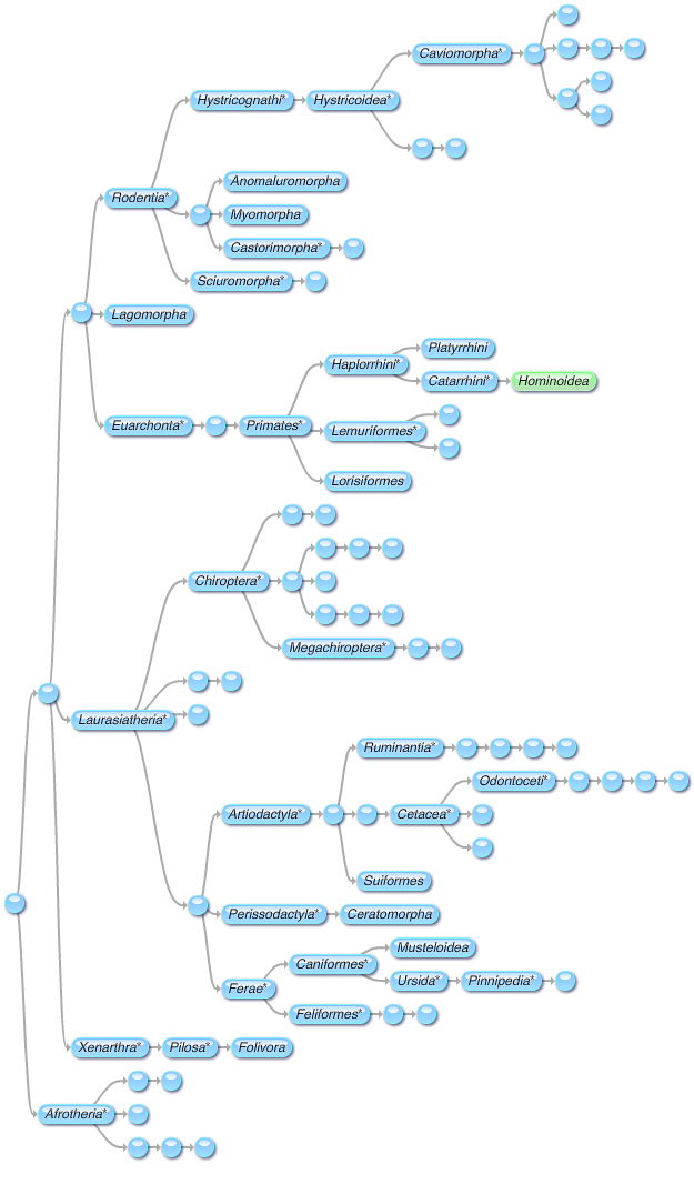
A common problem with working with phylogenies is that many of them are gigantic, far too big to view all at once. As an example, consider Figure 1 from Beck et al. (2006). It models a hypothesis about placental mammal phylogeny, at an arbitrary resolution ("family-level"). Here's how the current version of Names on Nodes renders it:


When you look at it "zoomed out", it's almost impossible to know what's going on. When you look at it full size, you can see various local areas, but you lose a sense of what's going on with the larger image. Note that I've highlighted our own species' twig on the tree (Hominidae, the great ape clade) in yellow.

Earlier I used the term "resolution" to refer to the size of the graph's nodes. We can refer to a graph with very small nodes (e.g., each node representing an individual organism) as being "fine" and a graph with very large nodes (e.g., "class-level") as being "coarse". Thinking about the problem from this angle, I had the idea to create a control for coarsening or refining the viewed graph.

I implemented a simple graph-coarsening algorithm*, and then created an algorithm for picking the best name for the new, coarser graph's nodes. And here is the phylogeny at near-maximum coarseness:


This is placental phylogeny boiled down to its basics: rodents, laurasiatheres, and a bunch of other junk (including us). The node labelled "Placentalia*" contains the placental ancestor but not all descendants—it lacks an unnamed clade included most non-afrothere placentals. The unnamed greenish node includes all members of that unnamed clade except for rodents and laurasiatheres. (This happens to include Hominidae, which is why it has that greenish color.)

Let's refine it one step:


We're starting to get a better idea of the hypothesis. Finer:


Now we can see the basal split between afrotheres and other placentals, as well as developing complexity in Rodentia and Laurasiatheria. Finer:

Getting a little bit on the big side, now, but we can see more details. There are a lot of unnamed clades within Hystricoidea and Chiroptera—we can see that those clades are diverse, although we can't see details. Finer:
This has about 2/5 as many nodes as the base graph. It's a bit large, but still much easier to view than the base graph. Many important details are visible (e.g., the platyrrhine-catarrhine split), while others are just suggested (e.g., lots of diversity in Caviomorpha).

Obviously this works best if lots of clades have been named. I think it'll be a useful for boiling a phylogeny down to an appropriate level: coarser for quick overviews, finer for in-depth discussion.


* Basic summary of the coarsening algorithm:
  1. Look through all nodes that have children, and find the ones whose children are all terminal (sinks).
  2. Merge each of those nodes with their children to create a "supernode".
  3. Merge all overlapping supernodes. (This is important for graphs where nodes may have multiple ancestors, although it doesn't come into play in this example.)
  4. Remove the supernodes from the graph and repeat from step 1. Keep going until no nodes are left.
  5. Add the supernodes to a new graph. A supernode is ancestral to another supernode if any of its subnodes are ancestral to any of the other supernode's subnodes.

15 January 2010

Mangani Individual Chart Update

First things first: want to contribute to Haitian relief? Here's a guide to the appropriate charities.


Second things second: I just posted an update to my diagram showing all known mangani individuals.


Previous version here.

I'm trying a different value scheme to differentiate the vertices and the text. I also revised the earliest species (kadabba, ramidus, and anamensis) based on a rigorous review of the primary literature, and added one early species that had been overlooked (praegens, which may be a nomen dubium but is certainly a mangani or stem-mangani). The later species were revised a bit as well, but not as rigorously.

I really wish there were some place that just listed every known locality with its number of specimens and least possible number of individuals. I've been slowly compiling my own as a Google spreadsheet, but I'd like a better way to catalogue it. Hmmm, perhaps it's time to return to another project of mine.

20 November 2009

More Human Evolution Diagrams

I'm nearing the end of work on a review of the case for human evolution. I've uploaded some of the diagrams to my Flickr account before. Some of these were just updated and some new ones were added: see The Case for Human Evolution (Flickr set).

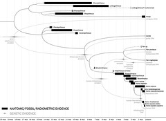
This is probably my favorite of the lot, showing the congruence between morphological/paleontological data (including radiometric dates) and genetic data (including molecular clocks):


(Click to see full size.)


Can you spot the single discrepancy? (No fair reading the caption on Flickr first.)


UPDATE: Revised some of the images, temporarily removed one.