A common problem with working with phylogenies is that many of them are gigantic, far too big to view all at once. As an example, consider Figure 1 from Beck et al. (2006). It models a hypothesis about placental mammal phylogeny, at an arbitrary resolution ("family-level"). Here's how the current version of Names on Nodes renders it:
When you look at it "zoomed out", it's almost impossible to know what's going on. When you look at it full size, you can see various local areas, but you lose a sense of what's going on with the larger image. Note that I've highlighted our own species' twig on the tree (Hominidae, the great ape clade) in yellow.
Earlier I used the term "resolution" to refer to the size of the graph's nodes. We can refer to a graph with very small nodes (e.g., each node representing an individual organism) as being "fine" and a graph with very large nodes (e.g., "class-level") as being "coarse". Thinking about the problem from this angle, I had the idea to create a control for coarsening or refining the viewed graph.
I implemented a simple graph-coarsening algorithm*, and then created an algorithm for picking the best name for the new, coarser graph's nodes. And here is the phylogeny at near-maximum coarseness:
This is placental phylogeny boiled down to its basics: rodents, laurasiatheres, and a bunch of other junk (including us). The node labelled "Placentalia*" contains the placental ancestor but not all descendants—it lacks an unnamed clade included most non-afrothere placentals. The unnamed greenish node includes all members of that unnamed clade except for rodents and laurasiatheres. (This happens to include Hominidae, which is why it has that greenish color.)
Let's refine it one step:
We're starting to get a better idea of the hypothesis. Finer:
Now we can see the basal split between afrotheres and other placentals, as well as developing complexity in Rodentia and Laurasiatheria. Finer:
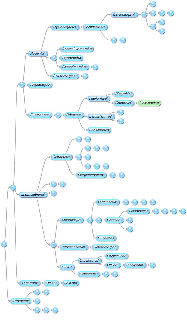
Getting a little bit on the big side, now, but we can see more details. There are a lot of unnamed clades within Hystricoidea and Chiroptera—we can see that those clades are diverse, although we can't see details. Finer:
This has about 2/5 as many nodes as the base graph. It's a bit large, but still much easier to view than the base graph. Many important details are visible (e.g., the platyrrhine-catarrhine split), while others are just suggested (e.g., lots of diversity in Caviomorpha).
Obviously this works best if lots of clades have been named. I think it'll be a useful for boiling a phylogeny down to an appropriate level: coarser for quick overviews, finer for in-depth discussion.
* Basic summary of the coarsening algorithm:
- Look through all nodes that have children, and find the ones whose children are all terminal (sinks).
- Merge each of those nodes with their children to create a "supernode".
- Merge all overlapping supernodes. (This is important for graphs where nodes may have multiple ancestors, although it doesn't come into play in this example.)
- Remove the supernodes from the graph and repeat from step 1. Keep going until no nodes are left.
- Add the supernodes to a new graph. A supernode is ancestral to another supernode if any of its subnodes are ancestral to any of the other supernode's subnodes.


No comments:
Post a Comment